Get your website ready for the Mobile Web in 10 steps
Posted 2007-11-14 in Mobile Web by Johann.
The mobile web is going to be the next big thing but is your website ready?
Here are ten techniques that will make your website ready for the mobile web.
1. Keep page sizes down
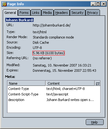
Ideally you want your page size to be less than 10 K or 16 KB. This is tiny, I admit, but you can include remote content on the client-side using IFrames, AJAX, Flash or hybrid AJAX/IFrame solutions such as inc.
The reason behind this is that some mobile browsers (Motorola, OpenWave) only load that much before giving up.
2. Add shortcuts
Make navigation of your sites easier by providing
- Links at the bottom of the page to jump to the top of the page again.
- Links at the bottom of the page to go to the home page.
- Links to the site map.
- Links to the search engine.
- Links to skip the menu and go directly to the content.
If you want, only show these links in mobile browsers by using a rule like .handheldShow { display: none } in your screen style sheet.
Use short link texts such as “Top” or “Home” for these shortcuts. Avoid empty anchor elements (<a name="anchor"></a>).
3. Use few images
Images are huge compared to the size of a typical web page. You should avoid using images that only serve presentational purposes.
- For logos, use CSS image replacement and define the rules only in the
screenstyle sheet. - For photos, use JPEG with high compression ratios and thumbnails. Note that some online photo sharing sites have rather low compression ratios for higher image quality.
- Compress PNG images with OptiPNG. This can be easily automated.
4. Use less text
Long text is painful to read on mobile phones because the user must scroll a lot.
You can use CSS to fade out certain text passages only on mobile devices. A simple declaration like .handheldHide { display: none } in your handheld style sheet is enough.
I use this in my blog to fade out the “Share/Bookmark” links and other smaller elements that do not make much sense in mobile browsers.
5. Avoid horizontal scrolling
Horizontal scrolling is especially bad on the smaller cell phones.
- Search for overly long words and use ­ or <wbr> to indicate places were the word may be wrapped. Unfortunately, support for ­ is far from perfect.
- Restrict the width of images to 100 % of the screen size using
img { max-width: 100% }. - Write short headlines and titles.
6. Provide a handheld style sheet
Of course you can and should define colors in your handheld style sheet that match your regular branding but the real beauty lies in the fact that you can fade out elements.
Embed the handheld style sheet before the screen style sheet and use a little bit of JavaScript for mobile browsers that don't get CSS media types.
7. Be careful with JavaScript
While some mobile browsers (NetFront and IEMobile) support JavaScript, they only do so to a certain degree. You can use JavaScript but – from my experience – it needs to be really simple and should be included before “serious” code is run.
There is no real way to debug JavaScript and in Windows Mobile’s IEMobile, JavaScript errors aren’t even displayed.
8. Get emulators
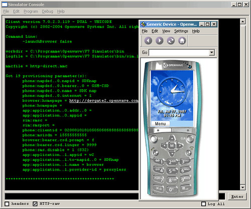
Most of the mobile phone emulators do a good job at giving you an idea of how pages will look like. Use them to find major problems.
Opera is great for its small-screen rendering support. Preview pages in Opera Mini with the Opera Mini bookmarklet.
9. Get mobile devices
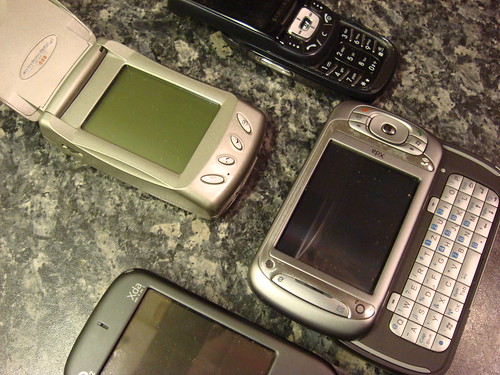
By using real mobile phones, you will discover usability problems you might not find using emulators.
- Buy a mobile phone with a low-level browser (Motorola browsers come to mind).
- Buy a mobile phone with a more fully-featured browsers (such as NetFront or OpenWave).
- Buy a PDA or a SmartPhone running Windows Mobile.
HTC devices running Windows Mobile 5 can be picked up used for little money. Windows Mobile devices are nice because you can test pages through ActiveSync with a local Internet connection.
Having a mobile phone with a “real” desktop browser – such as the Nokia E90 – is a great idea, too.
10. Keep mobile browser statistics
Go through your web server’s log files and extract the user agent strings. Build mobile browser statistics and see which popular mobile browsers you can cover with emulators and which ones you cannot.
I hope you find these tips useful. If you have more ideas or would like to add to this entry, please leave a comment.
4 comments
#1 2008-01-24 by York von Schönfels
Hello Johann,
This is an excellent post with a lot of useful information, thank you.
I have another point to add:
11. Keep the number of GET requests as low as possible.
York,
thanks for the praise. Keeping the number of requests low is another excellent suggestion. That means not embedding several style sheets or JavaScript files.
#3 2008-01-24 by Eoin
One strange quirk - some mobile browsers will still try and read stylesheets with a media="screen" attribute stylesheets with media="handheld". You can sometimes get around this by using media="Screen" - note the capital S.
Also, don't forget about Blackberry browsers - many of these don't support horizontal scrolling, meaning that wide content is squashed vertically down the screen. The blackberry emulator is a very handy tool for testing.
I'm still not 100% convinced that CSS is the short term solution for making a website mobile friendly. The differences between rendering on different desktop browsers is bad enough, without the differences between different mobile devices.
While one can use styles to determine what content is visible (on some mobile devices), you're still sending that content down, using up often expensive bandwidth. Also, some browsers - like the Blackberry - have limited support for CSS and for manipulating the DOM with JavaScript.
My inclination (at the moment) is to provide different pages for mobile and screen devices. This means less compromise on both platforms, although can mean more up-front development time.
Eoin,
thanks for the tip. The Blackberry emulators can be be downloaded after registration.
Subscribe
RSS 2.0, Atom or subscribe by Email.
Top Posts
- DynaCloud - a dynamic JavaScript tag/keyword cloud with jQuery
- 6 fast jQuery Tips: More basic Snippets
- xslt.js version 3.2 released
- xslt.js version 3.0 released XML XSLT now with jQuery plugin
- Forum Scanners - prevent forum abuse
- Automate JavaScript compression with YUI Compressor and /packer/