Linking CSS for handheld devices revisited
Posted 2007-06-02 in Mobile Web by Johann.
I described an effective way of linking CSS for desktop browsers and portable devices (mobile phones and PDAs) before.
However, some browsers have to be treated differently.
IEMobile/Pocket Internet Explorer
Microsoft’s mobile browser downloads and applies style sheets for the screen media type which produces interesting results when screen and handheld style sheets are mixed.
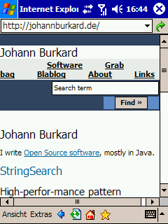
IEMobile showing my home page.
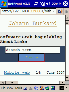
NetFront, PlayStation 3 and PlayStation Portable
NetFront is one of the most feature-packed mobile browsers that is embedded in many devices, for example in the Sony Ericsson K610i. Both the PlayStation Portable as well as the PlayStation 3 are also shipped with NetFront.
Unfortunately, it does not load any handheld but only screen style sheets.

NetFront v3.3 showing the HTML and CSS for Mobiles test page.
The solution
The following code will embed a style sheet for the handheld media type (for NetFront/PlayStation) and hide the screen style sheet from IEMobile and NetFront:
<link rel="stylesheet" type="text/css"
    href="handheld.css" media="handheld"/>

<script type="text/javascript">
if (/(NetFront|PlayStation)/i.test(navigator.userAgent))
    document.write(unescape('%3C') +
    'link rel="stylesheet" href="handheld.css"\/' + unescape('%3E'));
if (/(hiptop|IEMobile|Smartphone|Windows CE|NetFront|PlayStation|Opera Mini)/i
    .test(navigator.userAgent))
    document.write(unescape('%3C%21--'));
</script>

<style type="text/css">
@import url("handheld.css") handheld
</style>

<link rel="stylesheet" type="text/css"
    href="screen.css" media="screen,tv,projection,print"/>

<!-- -->
The gory details
The first line simply embeds a handheld style sheet. Nothing special here.
<link rel="stylesheet" type="text/css"
    href="handheld.css" media="handheld"/>
A handheld style sheet is written to the page in this test for NetFront or PlayStation:
if (/(NetFront|PlayStation)/i.test(navigator.userAgent))
    document.write(unescape('%3C') +
    'link rel="stylesheet" href="handheld.css"\/' + unescape('%3E'));
The JavaScript then writes a starting comment (<!--) in case the user is using IEMobile or NetFront.
if (/(hiptop|IEMobile|Smartphone|Windows CE|NetFront|PlayStation|Opera Mini)/i
    .test(navigator.userAgent))
    document.write(unescape('%3C%21--'));
From this point on, IEMobile and NetFront will skip the following:
<style type="text/css">
@import url("handheld.css") handheld
</style>

<link rel="stylesheet" type="text/css"
    href="screen.css" media="screen,tv,projection,print"/>
This links the handheld style sheet and the style sheet for desktop browsers. The handheld style sheet is embedded after the JavaScript so that IEMobile/Pocket Internet Explorer will not request the same stylesheet again.
<!-- -->
This empty comment ends the linking. IEMobile will perceive this as the end of the comment.
The result
My home page is now looking great in IEMobile and NetFront. For other mobile browsers, find out how to test handheld style sheets in other browsers.
Subscribe
RSS 2.0, Atom or subscribe by Email.
Top Posts
- DynaCloud - a dynamic JavaScript tag/keyword cloud with jQuery
- 6 fast jQuery Tips: More basic Snippets
- xslt.js version 3.2 released
- xslt.js version 3.0 released XML XSLT now with jQuery plugin
- Forum Scanners - prevent forum abuse
- Automate JavaScript compression with YUI Compressor and /packer/